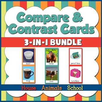
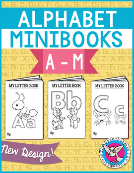
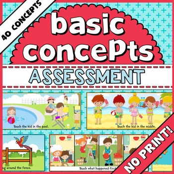
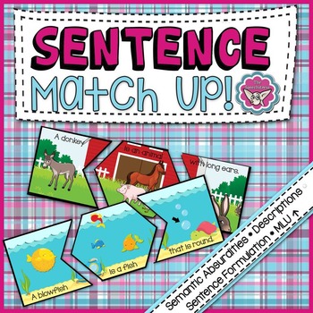
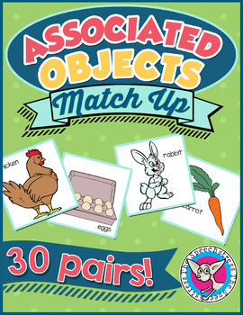
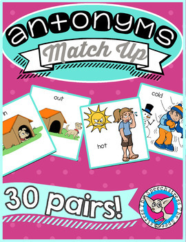
Product covers are a passion of mine. I'm nerdy like that! The play of the shapes, colors, and fonts is almost therapeutic for a left-brain dominant person such as myself. Yes, I struggle to back my car out of the driveway, peel a potato, or do any mathematical operations more advanced than long division. But for some reason the TpT gods have smiled on me in the area of product covers, and I've been able to create many that I like and feel are effective. I've been asked for advice by many sellers over the months on creating good covers, so I am taking the opportunity to share my thoughts and opinions on what makes an effective product cover.
We can all think of popular TpT products with less than stellar covers. So, do attractive covers really mean more exposure and more sales? I don't know if there's research out there to substantiate an answer, but I strongly suspect that yes, they do. While some great products gain popularity despite their covers, there are many more fabulous materials that are passed over because of their unappealing exterior. Great covers give the seller an advantage for these reasons:
You don't have to be a graphic designer to develop your own style. You can create your own cover aesthetic that fans will recognize by choosing a few simple elements to include in each cover (e.g., same font, same type of background, same color palette, etc.). This creates consistency across your covers, but still gives you room to individualize them for each product.
A good example of this are Natalie Snyders' covers. I recognize many of them when I come across them on Pinterest and TpT blogs because they share a similar style without looking the same. She uses the same fonts, a large shape in the middle of the cover that contains the title, and a complementary background. There are only a few elements in the covers below, but they are effective because they use eye-catching color palettes, clean lines, have attractive, easy-to-read fonts, and have their own unique style that is distinctly Natalie's. There is aesthetic cohesiveness not only within the elements of an individual cover, but across covers as well.
Browse through product listings on TpT and notice the amount of white space used on the covers. As a general trend, I bet you will find that the less white space that is used, the more polished, attractive, and compelling you will find the cover.
Use bright, bold colors, pretty fonts, and fun graphics. Some of my favorite covers that I've designed appeal to the imagination and tell a little story. I try to make my products fun for adults and students, and I want my covers to capture and reflect some of that playfulness.
The cover is an opportunity to display some of your product's best attributes, through text or through pictures. I like to include a small sample of my product on the cover so that buyers can immediately see what's included.
 |
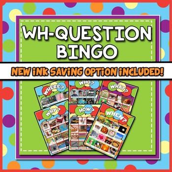
"WH-Question Bingo" is by far my best selling product. On the cover, I've displayed 6 of the different boards that come with the product, to give the buyer a sense of quantity and variety. I've also highlighted an important update to the product (lower-ink version).
Invest in high quality clipart and background "papers". These are the tools of the trade for crafting good product covers. Read where I get mine in the FAQs below.
What information needs to go on the cover?
The cover's job is to attract attention to your product and make the buyer want to see more. The only absolutely necessary piece of information, to my mind, is the product title. As the buyer goes through product listings, she can get the relevant info from the description next to the cover image. Too much text on the image is distracting and difficult to read. Because I know the buyer will be looking at the cover, however, I do sometimes like to include brief product highlights or information that will make my product appear more attractive (e.g., "New Ink-Saving Option!", "TpT Featured Freebie!", and "Hours of Activities Included") or clarify/summarize an aspect of my product. Including your logo on the cover is a great idea, as it promotes brand recognition. I've been meaning to go back through my covers and add my logo.
 |
| The cover doesn't need to contain a lot of information on it, because relevant product information is displayed beside it. |
What program do you use to make your covers?
 |
| Made with Microsoft Word. A labor of love! |
Where do you get the graphics for your covers?
While the choice of commercial-use graphics for TpT products used to be limited, more and more clipart designers are opening shops on TpT and Etsy (my two favorite sources of clipart), making their products available and affordable to TpT sellers. When you buy clipart from these sites, make sure you read the licenses that come with them and that they state that commercial use is ok.
 |
| Prettygrafik clipart. |
When I look for graphics for my covers, my search is divided into two elements: clipart images and background "papers" (the background motifs). The price range for a set of clipart images or papers runs from about $1 - $6. While it's tempting to stick with the $1 deals, I don't mind spending a little extra money on higher quality images because they add so much to my products. Currently, my favorite clipart designers are Prettygrafik and Best Teacher Tools (aka AMBIllustrations). Their products are a great combination of high quality and low cost.
For those of you who prefer not to buy clipart, a great source of free clipart and images is Pixabay. Everything on this site is public domain, making it ok to use commercially without having to ask permission or credit the creators. Be warned that the quality of the clipart is highly variable!
 Many TpT sellers use Boardmaker images in their covers and products. The legalities of this are not entirely clear to me, even after reading Mayer-Johnson's Usage & Licensing info. It appears, however, that it is all right to include Boardmaker images in a product, as long as there are 50 images or less per product and credit is given to Mayer-Johnson. Even though I have access to Boardmaker, I do not use the images. They tend to be abstract, minimalistic, and less than visually appealing. While they may be effectively used in AAC boards, as cover art they leave much to be desired. Unless you are selling an AAC product that uses Boardmaker images, I suggest avoiding the eggheads!
Where do you get the fonts?
 |
| Some of my favorite free, commercial-use fonts. |
I like to use several different fonts on each cover, and especially like the contrast of chunky fonts with skinny fonts.
 |
| The title contrasts chunky and skinny fonts. |
Where do I start?
If you are a completely new seller, don't feel like venturing into the graphic design realm, or are just looking for a simpler way to construct your covers, buying a seller's starter kit might be the way to go. Starter kits include everything you need to begin making covers: color coordinated frames, backgrounds, shapes, etc.
 |
| Teaching Talking's Seller Starter Kit. |

Click here to download your list!


